Dashboard
The Dashboard is TradeFlow’s home screen, providing an at-a-glance overview of your trading performance through KPI cards, interactive charts, and a calendar heatmap.
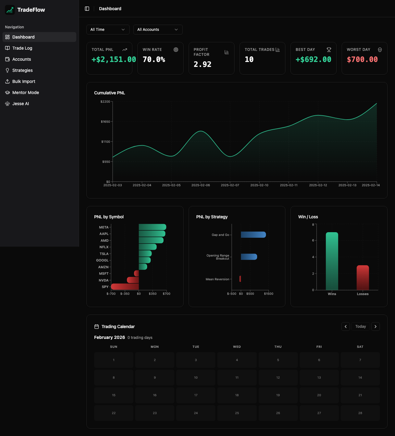
KPI Cards
Four summary cards appear at the top of the dashboard:
- Total P&L — Net profit or loss across all trades, color-coded green (profit) or red (loss)
- Win Rate — Percentage of winning trades out of total trades
- Profit Factor — Ratio of gross profits to gross losses (values above 1.0 indicate profitability)
- Total Trades — Count of all logged trades
These metrics update in real-time as you add, edit, or delete trades.
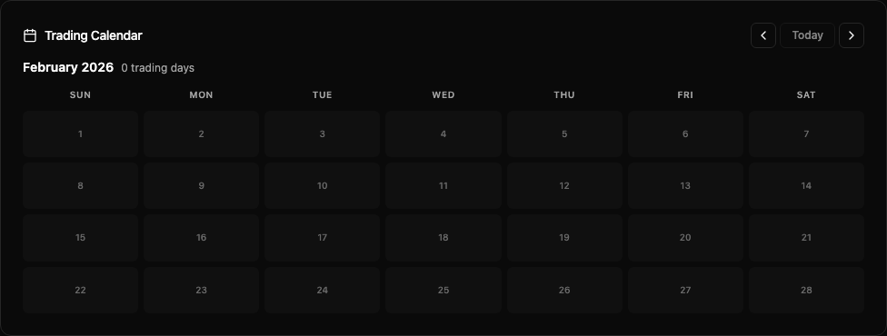
Calendar Heatmap
The calendar displays a month-at-a-time view with P&L values shown directly on each day’s box:
- Green shading for profitable days
- Red shading for losing days
- Navigation controls allow you to move between months using arrow buttons
- 3-letter day labels (Mon, Tue, Wed…) appear as column headers
- P&L amounts are displayed inline on each day box for quick scanning
Charts
Cumulative P&L (Area Chart)
A smooth area chart showing your equity curve over time. This reveals whether your account is trending upward, experiencing drawdowns, or plateauing.
P&L by Ticker Symbol (Bar Chart)
A bar chart breaking down total P&L per instrument. Quickly identify which symbols are most profitable and which are dragging performance.
P&L by Strategy (Bar Chart)
A bar chart showing total P&L per strategy. Compare strategy effectiveness at a glance.
Chart Styling
All bar charts feature:
- Gradient fills — subtle color gradients for visual appeal
- Rounded edges — bars are rounded on the end away from the axis and flat on the axis side
- Green/red coloring — profits in green, losses in red
- Responsive design — charts resize to fit the available viewport
Data Source
The Dashboard pulls data from the same IndexedDB trades table that the Trade Log uses. All metrics recalculate automatically using Dexie’s useLiveQuery reactive hooks — there is no caching delay.